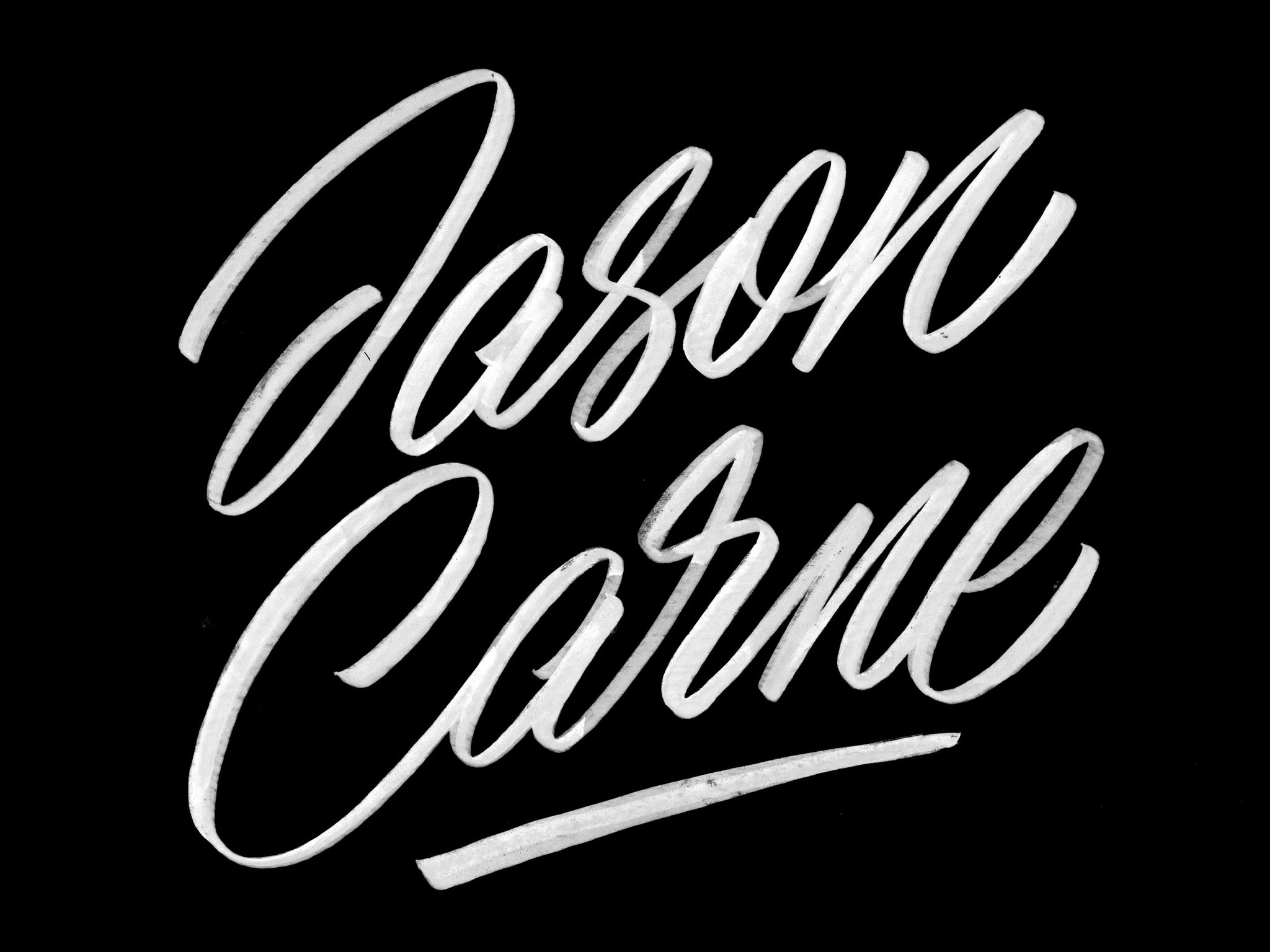
Designer, illustrator, hand-letterer and most recently typeface-designer. It seems there is almost no project Jason Carne can't tackle. For those who didn't know — Jason and I are partners here at Carmel. We've gotten to know each other really well over the past year. He is one of the most humble and friendly designers I've yet to encounter in the creative circles I've participated in. What impresses me most is that Jason is forever a student. His curiosity has played a leading role in going freelance, start the Lettering Library project and now Carmel. I enjoyed having the opportunity to ask Jason the "standard" questions about his background, inspiration and challenges. Enjoy!
Were you always interested in hand lettering?
Yes, but that comes with a bit of a caveat — I was interested in lettering without being conscious of being interested in lettering. When I was younger (and even still to this day) music was a huge part of my life, I obsessively poured over every inch of the album layouts and read the lyrics over and over again and scoured the liner notes for new artists to listen to. What I didn’t realize was that the band logos were in part driving me to purchase the music I was listening to.
Before the internet made checking out new music effortless, you had to either go off of the recommendation of other people or make a “blind buy” based on the album cover and hope what you purchased was worthwhile. For about 15 years or so now, I’ve been very big into metal music of all varieties and within that genre (which has endless sub-genres) there were distinctive lettering styles that characterized how the band would sound. I began to able to tell what a band would sound like before I heard them - for example, thrash metal bands like Exodus, Anthrax, Megadeth, etc. all had these very angular “fast” metallic and chrome logos but if it was a black metal band like Immortal or Mayhem it had a much more evil feel to it, and lots of times it incorporated Gothic (AKA Blackletter/Old English) type for their album titles and logos. These lettering styles revealed to me that you can convey a message through typography or lettering without having to say very much - it was all in the aesthetics.
Some of the more exceptional band logos like Voivod’s or Darkthrone’s stuck with me and I remember drawing them repeatedly on my notebooks in school. I wish I still had some of my old notebooks, I filled the covers of every with hundreds of band logos, and I think that was unwittingly the origin point of my hand-lettering career.
How did you decide to go freelance?
I worked a lot of jobs I just flat out did not like when I was younger but I did them because I didn’t view art or design as a viable career option because that’s what I had been told my entire life. I pushed shopping carts around for a supermarket, I did telemarketing for a (probably bogus) auto-warranty company, I spent half a year in computer sales, I did overnight stocking; I just did a bunch of awful jobs for awful pay. I also did some construction and demolition which I didn’t mind, but I still had a passion for art and design. Some friends of mine knew that I could draw pretty well from seeing my sketches and doodles in high-school, so they wanted me to create artwork for their bands. I had no clue how to create artwork for reproduction or even do anything digitally at all, but a guy I was good friends with for a few years knew how to use Photoshop and taught me how to use it over a few months time — we were actually even partners for about a year or so. We did all sorts of stuff for the local bands we both knew — logos, flyers, album covers, and our bread and butter — Myspace layouts! Once I stopped designing web layouts for bands I got more into the merchandise design arena and started selling pre-made designs to bands on a website that’s now long gone called Emptees. Dribbble was the game changer though, that site really kickstarted my lettering career big time.
Do you remember your first commercial design project?
As in the first job I got actual money for? I actually don’t remember what that would have been. The first job I remember doing was a Myspace layout for a death metal band called Embryonic Devourment (cute name right?). Tony Koehl (who is basically a household name in the death metal art world) did their album cover and I remember being really excited to use it on the layout the band commissioned me for. Looking back on it now, the layout was SO bad, like unforgivably terrible. I truly can’t believe I was actually paid for it, but hey, it was one of the stepping stones that got me to where I am today and they were happy with it!
What is your favorite part of the creative process?
The concept sketches, the rough and early parts of the process where you get that burst of initial ideas. A close second would be solving a difficult problem in a design or a typeface successfully — that brings me a lot of satisfaction.
What part of the process do you struggle with creatively?
Completion — finishing a project and letting it out into the world is the hardest part of the entire creative process for me. The process of creation itself is so rewarding and so fun, but it’s scary in a sense to “finish” something because to me that means that it’s as good as it can possibly be and I’ve accomplished all that I have set out to when it’s done. I have a tendency to overwork and overthink things quite frequently, and I think that because of that I struggle with just getting a project checked off of my list and moving on to something else. I don’t feel like it’s a bad thing to be a perfectionist, but it can sure drag things out sometimes.

Do you have any daily rituals or routines built around your creative process?
I don’t, which I feel like sounds odd considering that so many people I know in this industry have rigid, unwavering schedules and I kind of just float through the day. The only thing I can say is fairly consistent for me is that I check my emails when I get up, and I spend about 30 minutes or so every morning just browsing sites like Dribbble and Behance to see what other designers are doing or creating. I keep a list of current projects, but I just kind of bounce back and forth from them day to day, not without reason though. I feel like it’s important to work on whatever you’re passionate about at the moment which sometimes means putting a project on hold for a day or two to work through a mental block and consider different angles to approach a problem with a new vigor and a new angle (unless a pressing deadline is forcing your hand to finish something urgently).
You are a self-proclaimed music enthusiast. What are your top 5 albums to listen to while you work?
Oh wow, now this is my kind of question, I can talk music all day. I’m going to just run with whatever pops in my head right now because I can debate this with myself endlessly if I think too long on it. I’d say my top five “work albums” at the moment would be as follows:
- DJ Shadow - Entroducing…..
- Deltron 3030 - Deltron 3030
- Ulver - Blood Inside
- Swans - White Light From the Mouth of Infinity
- Tom Waits - The Heart of Saturday Night
*Honorable mentions:
Bohren & der Club of Gore - Sunset Mission / Unkle - Psyence Fiction
What led you to start designing fonts?
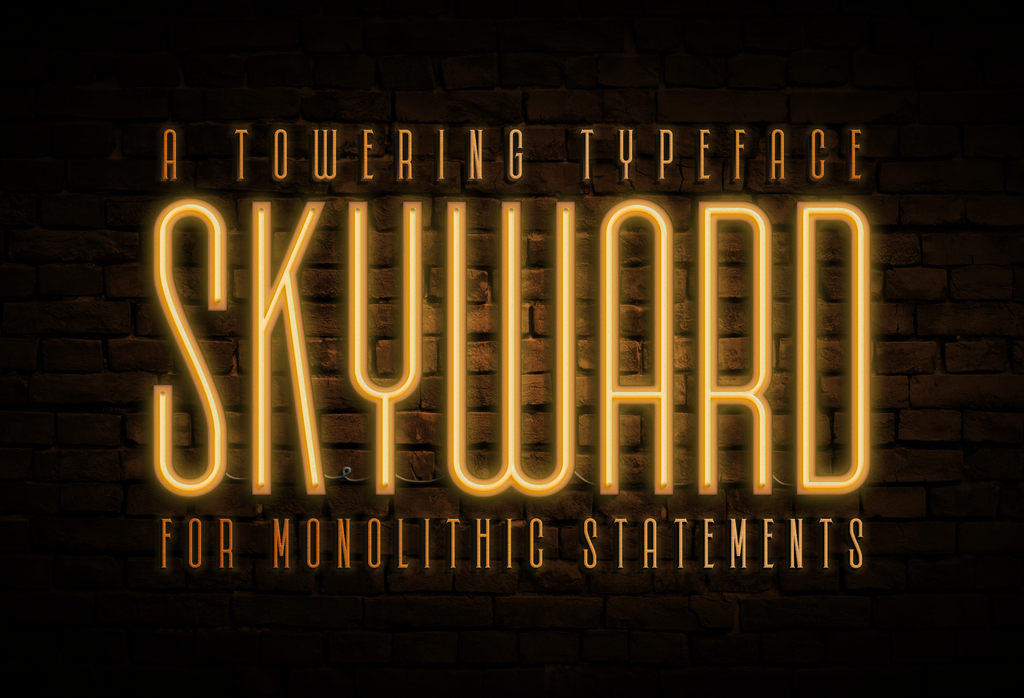
Two things were the catalyst for leap into the type world, a freelance branding project, and a chance meeting with Mattox Shuler of Fort. I was hired to create a logo for a band named Smashing Satellites in early 2014, and instead of doing a hand-drawn logo like I was doing frequently at that time I decided to try to create something digitally. When I did that I created 11 letters of an alphabet for their logo, I thought to myself that I’m almost halfway through the alphabet, I might as well just finish it out, so I did. That 26 character uppercase alphabet became the foundation for Skyward, our biggest font family in our catalog.
I did nothing with the alphabet for a few months because I had no idea how to develop what I had and turn these vector letters into a functioning font. Flash forward a few months, and I was speaking at an event called Creative South in Columbus, Georgia with my friend Keith Tatum. As a generous gift, Mike Jones who helmed the event let all of his speakers attend the workshops there that year for free - the first one I attended happened to be on type design which Mattox was running. I instantly became curious after that workshop and came home to revisit the 26 letters I had made and expand upon them. I thought…I’ll just add the numbers and some basic punctuation, then I’ll call it done.
However, my problem with completion (see question 6 above) wouldn’t let me leave it at that — I developed a full lowercase alphabet, an extensive set of special characters and Latin accents. Again, that wasn’t good enough, I then went ahead and created an inline version of the font, and a version with serifs, and an inline serif version, then oblique versions. I now has 8 fonts designed but they were useless because I had no way of developing them. Eventually I reached out to you about doing the development side of things and I think that was actually how we met.
We recently started Carmel Type Co. together. To be honest I can't remember really how it started. What do you remember about how and why we started Carmel?
Well, I think it was about 6 months or so after we put out Skyward. I was designing my second typeface Railroad Co. and I wanted to team up again like we did with Skyward when we self-released that. The process for both Skyward and Railroad Co. were so fun that I think I just put you on the spot and asked if you wanted to team up permanently because you were doing so much font work at the time too. I had the name ready immediately, it came to me right away and hit me like a lightning bolt — so that was solved. I think we had a logo, a website and a handful of fonts up within a week or two of that first phone call, we really worked really fast on the launch!
We originally thought that it was going to be just us releasing our own type here and there as a passion project or side job, but it quickly evolved into something we’re both basically doing full time now. When Noel Weber, Gary Godby, and a few others messaged me about potentially selling their fonts I felt like we were on to something more here, that it could be an outlet for other designers and our friends to sell with us. So Carmel evolved really quickly, but it’s still us basically doing what we want to do — just with a few friends now.
Where did the name come from?
The simple answer for the name is that it’s a hybrid of our last names — CARne and MELton. Deeper than that though it recalls the best trip I’ve ever taken which was with my wife last year when I proposed to her in California. We rented a house in the town of Carmel-by-the-Sea and it was just like being in a different world from where we live and the areas we’ve seen our whole lives. So, for me, Carmel is a representative snapshot of a great time in my life and marries my love of type with my love of travel and my of my wife Melissa.
In addition to freelance and designing fonts for Carmel you also run the Lettering Library. A website of out-of-print lettering books that you photograph and share as affordable PDF's. How did that project come about?
I got the idea at the same Creative South event I referenced above where I met Mattox in 2014. I was a speaker doing a talk for the event with Keith Tatum and our whole talk was based are preserving the past and why it’s important to keep the old stuff alive, whether it be ephemera, photographs, books, or anything that shows our shared visual heritage and artistic history. The concept of our talk got me thinking about what I could do for the design community to make content like that actually accessible. I had amassed a pretty decent collection of antiquarian lettering books at that point (which has grown rather substantially since then) and decided that these long out-of-print and out of copyright books could be helping and teaching others rather than just sitting on my shelves, keeping them only for my own reference. So Lettering Library is basically my “thank-you” to the design community at large and my way to pass on something useful and helpful to my peers.
What should we expect to see from Jason Carne in 2016?
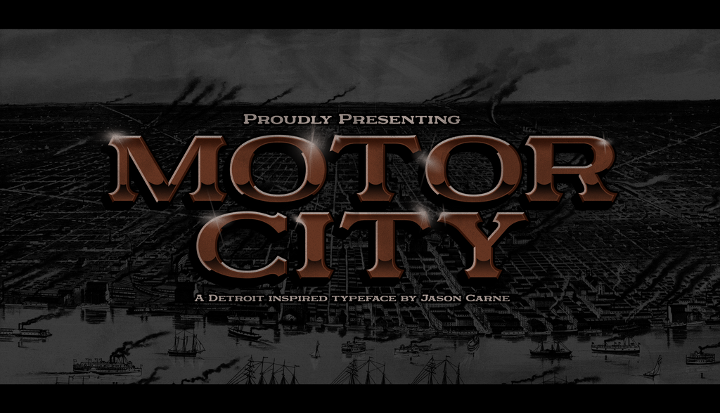
I’m hoping to get at least three or four more typefaces completed this year (on top of Motor City and Alchemist that is) and if all goes well, start putting together a book that I’ve wanted to publish for some time now. I’d also like it if I could snag a few interesting packaging or branding projects this year, that’s where my interesting have been heading towards lately.
Finally, what advice would you give a young designer who is interested in learning hand lettering?
Learn the fundamentals first — I know the flashy and ornamental stuff is what draws a lot of people in (myself included, it was like a tractor beam) but knowing the proper formation of basic letter shapes will make your work in the future so much better and will build good habits in you right from the start. This is advice I wish I had been given when I started because I dove into the deep end with the really decorative and wild stuff which came out decent enough, but looking back on that early work of mine I had proportion and weight way wrong way too often. There’s something to be said for hand-lettering having a human touch and the charm of imperfection, but that should come from a place of it looking natural, not uninformed.
Also, seek out a mentor — having someone knowledgable who can give you some time once in a while, or even frequently if you’re lucky, will do more for you than just about anything else. Another point of advice worth noting would be to listen honest and real critiques — no one ever improves by being told that everything they do is perfect, but ignore those who are downright insulting and crass about your work, their opinion is not valuable. This is a rewarding craft and the more you stick with it, the more you love it, so just start drawing and have fun with it.
See more of Jasons work on his portfolio. You can also follow him on Dribbble, Behance and Instagram.
1 comment
Feb 22, 2016 • Posted by David Grimes
Very cool stuff, guys! I particularly like the sentiment about mentorship and I wholeheartedly agree. The work that Jason did with Skyler Chubak this year was incredible. If that’s any indication of the level of polish that he puts out, he’s in good shape.
Leave a comment