
Last year a friend of mine took me out to a local attraction that I had somehow never heard of, a railroad museum with everything from the steam engines and passenger cars themselves, to the advertising and historical documents of the railroad companies that operated within the central and north-eastern Pennsylvania regions. The Steamtown National Historic Site is located at the former train yards of the Delaware, Lackawanna and Western Railroad Company (DL&W) in Scranton, Pennsylvania and contains a functioning replica roundhouse erected from plans and pieces of the original structure that existed from the 1860's through the 1930's.

Heavy, lumbering, powerful machinery has always fascinated me, particularly the oversized Goliath's of mechanical wonderment produced during the Industrial Revolution. North-eastern Pennsylvania was a hotbed for steel, coal, anthracite, iron, and slate during that era and many railroad companies thrived during a large economic boom and were profitable enough to build cities and communities from harvesting the raw resources beneath their feet and connected them laying many miles of tracks to New York City and Philadelphia. While many of the cities in this region today have seen a large economic downturn due to the collapse of the fossil fuel industry and have become shells of their former selves, this historic railroad site provides some a glimpse into the bustling and booming city that Scranton and the surrounding communities once were.
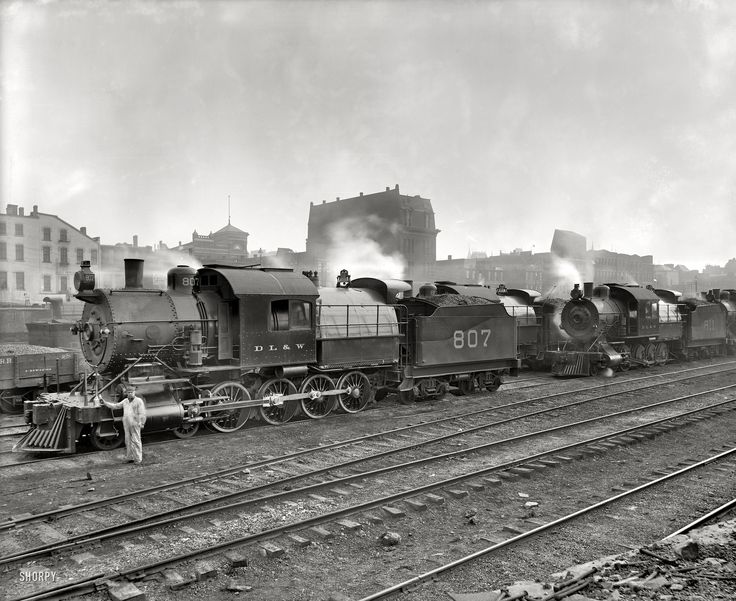
While I really love and admire the raw power and herculean feats of strength these engines are capable of, what I'm really enamored with were the aesthetics of these titans of transportation. Many train-cars were adorned with beautiful colors, gorgeous decorative striping jobs, and fantastic lettering. Being that the passenger cars were rather long, and that their sides were made up primarily of windows, wheels, and curved roofing panels, there was not much room left over for the lettering itself oftentimes. This problem called for a style of lettering that was both wide, heavy, and somewhat squat that would be bold enough to be read from a distance and while moving. These types of letters have always caught my eye as they're not used in many other locations save for the occasional long storefront sign or transom lettering job. After a little research I determined that there weren't many options for lettering such as this on the market and wanted to make my own version of this iconic letter style.
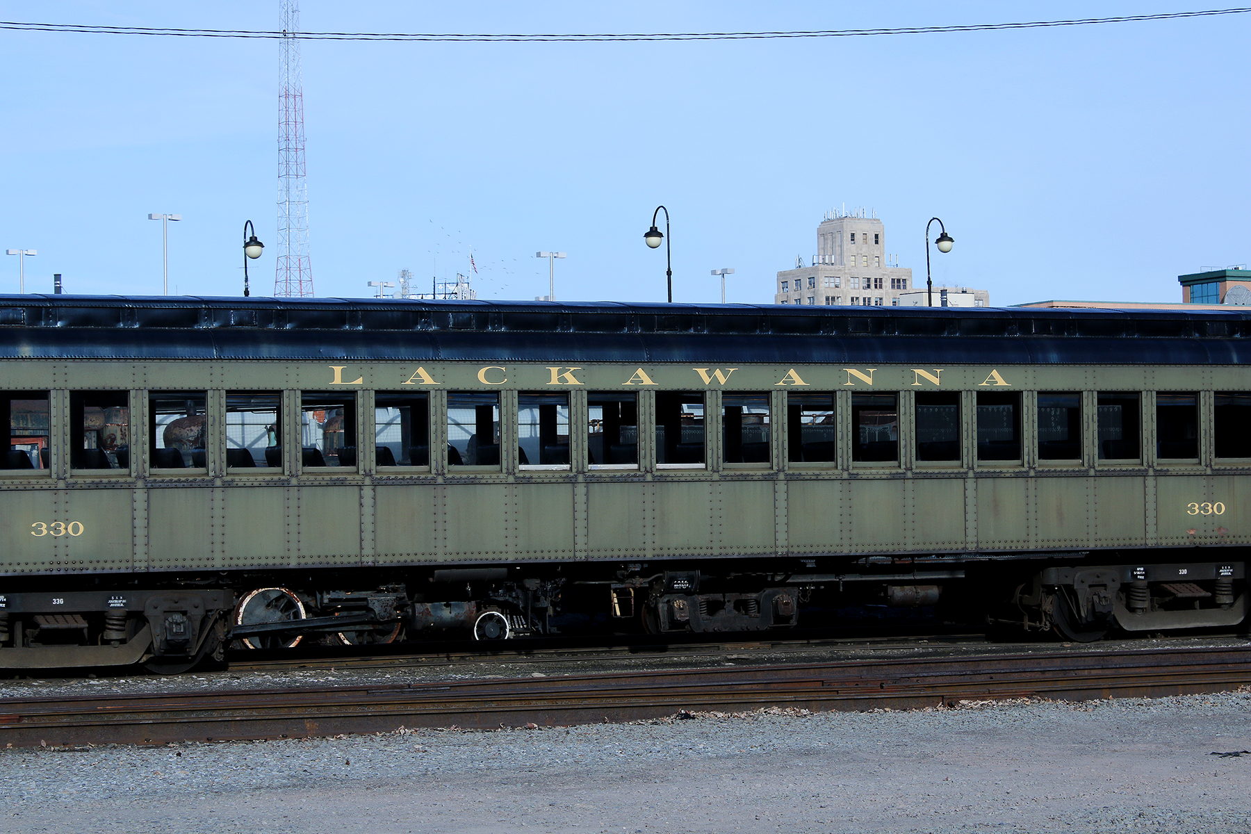

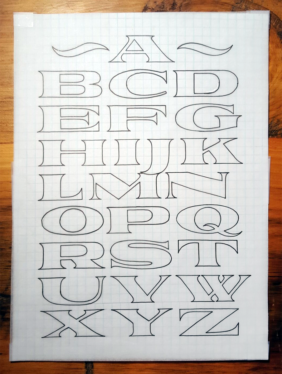
This project was an exercise in extremes, both in stroke weight, stroke contrast and in letter width. I knew I wanted a very wide and stout letter with a significant level of contrast between my heavy and light strokes. This created a struggle in balancing style and legibility and some letters were downright difficult to construct within the parameters I had set (the S comes to mind as a letter that was a particularly stubborn thorn in my side during development). I came to the conclusion that hard, straight lines and elongated, wide curves were the way to get the look I wanted without impacting legibility, which also defined how I created the serifs. I initially went for a more subtle and subdued approach to the serifs for Railroad Co., but as the letters began to take form I felt that they needed larger feet to stand on - whited prompted me to give it the early working title of "Platform".
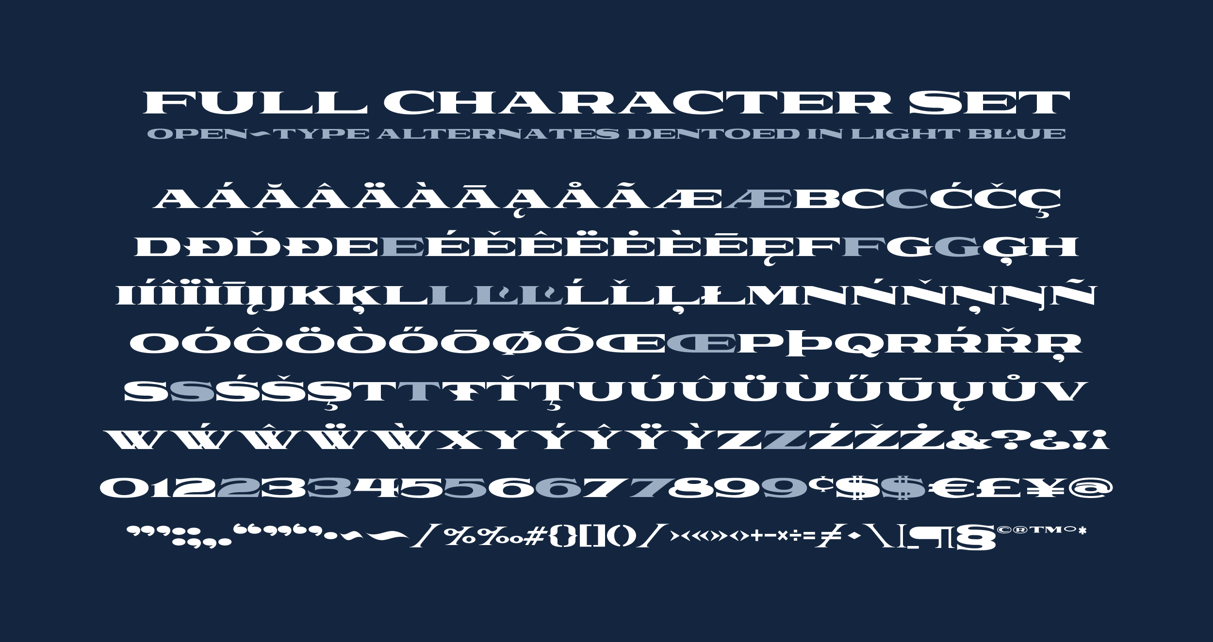
Another challenge I faced on this typeface was in making the punctuation, accents and special characters as there was very little reference to base my design of these elements on. Railroad Co. is in every sense a display typeface, and I very well could have left it simply at the uppercase alphabet and the numerals, but I felt it important to go beyond making just the standard American-English alphabets and make it an inclusive, functioning typeface for more users.
Thanks for reading how and why I created this typeface, I hope you enjoyed seeing the reasoning and process behind the construction of Railroad Co. You can pick it up in the shop for a special rate of $30.00 this week only, enjoy!
Leave a comment