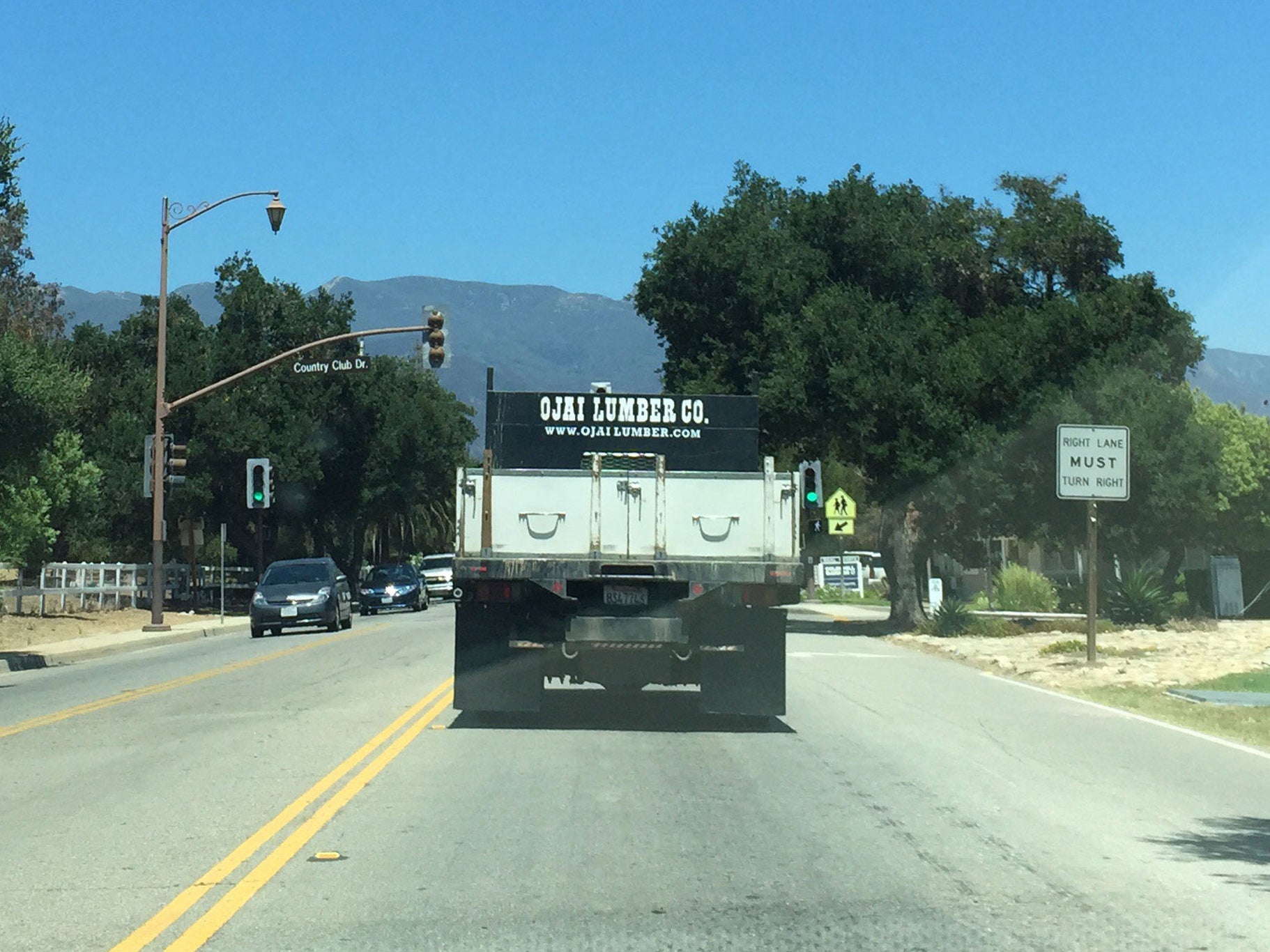
It's not often that you remember the exact moment an idea hits you. I remember the moment I was inspired to come up with Lumber Co. It was during a long weekend vacation with my wife in Ojai, CA. On the way back from a morning of surfing at Mondo Beach (a super beginner beach) we found ourselves held up behind a large truck. I was annoyed until I noticed the slab serif that spelled out Ojai Lumber Co. across the back. I whipped out my phone and took an illegal picture while driving (above). I had been in a creative slump for some time but all of the sudden I couldn't wait to get back to Los Angeles so I could get started on this typeface design.
2 weeks later I had nearly finished designing the entire Lumber Co. family. A slab serif like this is built on many common components. And because each pieces contributes to the construction of multiple other character the more you create the more efficient the creative process becomes.

I had initially planned on only designing a heavy weight based on my image of the truck but as soon as I had designed the heavy weight I started on designing an ultra-light weight. The ultra-light felt like a necessary contrast to the serious bold weight. This was also the first font I where I used the interpolation feature in Glyphs to create the weights instead of designing them manually. I have to admit that it was difficult for me to pick up at first. But learning this process has been invaluable for future, multi-weighted releases and font expansions.

What I love most about designs based on vintage letterforms is the ability to expand the scope of the original concept. It was important to me to make this western style accessible for our European friends to enjoy. Lumber Co. comes equipped with a full range of accent characters. Creating these characters is not only educational but satisfying when I see the old west meet European accents.

The goal for every font I create is to come up with designs that are useful and expressive at the same time. This inspires me to come up with a number of stylistic alternative characters. If you're itching for a different vibe from certain characters you will find many alternative characters for your enjoyment. Look for future updates to the font with even more stylistic alternates as well as useful contextual ligatures.

The most challenging characters to design and interpolate were the special 'AND' and 'THE' glyphs. This was due to the quantity of points I had to match up in such a detailed design. Look for them in the glyphs pallet of each weight.

I believe that all great fonts deserve great ampersands. It was important to me that we have ampersand options that feel authentic while expanding the expressive range of whoever is using them. Lumber Co. comes with 3 unique ampersands to meet your every whim.

In the end Lumber Co. is just another attempt at trying to bring the best of the past into the 21st century. We hope that you appreciate and enjoy the hard work that goes into each and every character. For me, every font release is the product of curiosity, education and hard work. In the future I hope to expand and develop these typefaces for years to come. Look for future expansions to the Lumber Co. family including a shadow layer and new weights. It's only going to get better from here. Please let us know your favorite features of this family as well as what you would like to see more of in the future.
Leave a comment